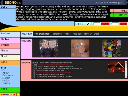
Implemented "LCARS" design, the Star Trek standard "Library Computer Access/Retrieval System" user interface.
Snapshot of version 10.1:

Resources: Dev notes:
Proof of concept (2010.03.15): Have put a first few hours into exploring the idea, and it went even better than expected. Surprisingly, only one website I've found (lcarsdeveloper) functionally implements the design for content and navigation. There's some klunky kludges, but not even memory alpha really commits. Hence some key aspects are weakly defined, also fictional and diverse over time. With no strong example implementations, I'm having to work through some details myself.
Alpha (2010.03.22): Rough LCARS skin option added on color scheme control page. Lacks important navigation elements, also nested items and home page need formatting, and moving of tool links to the new mid-bar.
Beta (2010.03.25): Finished all rounded corners, main navigation (with distinct shades by area), buttons, and tools (share, comm, scan).
Remaining tweaks pending:
- Change supporting links (mininav,album,zoom,place,gps,offsite,related,...) from simple reverse text, into action tabs on sweep bar.
- Scans need area sub-search awareness.
- Terse links not responding in Kudos.
- Consider bringing weather and maps into embedded form.
← → ⇤ ⇥ ■ ↑ RELATED
2010.03.22